Improvement of pop-up card and update of main site
I updated the main site after a long time. I was too much lazy.
This time I updated the architecture of Hokkaido, I also uploaded the former Sapporo Police Station and the former Sapporo City Public Hall that I posted on my blog the other day.
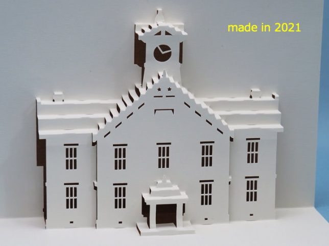
When I’m preparing to update the main site, I also see past cards. I made it myself, but I felt some of the cards aren’t good.
I couldn’t leave it alone, so I made corrections to my past works.
The photo above is the former Sapporo Agricultural College performance hall. The name Sapporo Clock Tower is better known.
I first made the card in 2003, 18 years ago. Later, I updated it to ver. 1.1 and then ver. 1.2. The latest card is 11 years ago.
The following picture is the card I made in 2010.
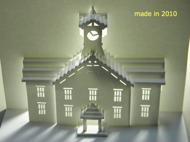
I felt the clock tower was a little slender, so I lowered it a little and adjusted it so that the width was a little wider.
In addition, the eaves at the entrance have too many creases and are difficult to fold, so we reduced the number of steps to three.
The fold lines on the roof are incised in places to make folding easier. And I made the chimney on the other side of the roof visible.
I also adjusted the height of the building a little, so I rewrited almost the entire pattern.
This is another card.
Former Kyosei Company in Otaru City.
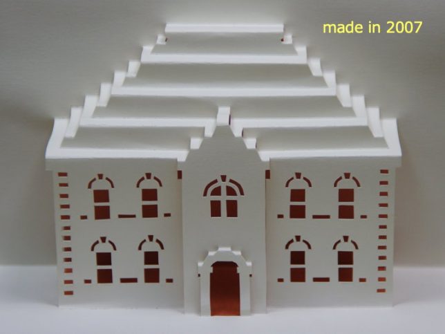
I made this pop-up card in 2007.
I feel that the height of the roof is strange. I want to ask my past self, “Hey, are you really okay with this?"
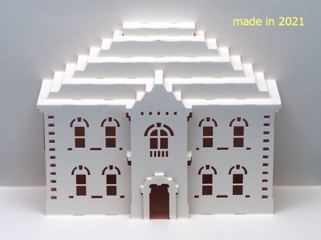
Therefore, the height of the roof was lowered a little.
There are also notches in the roof crease to make it easier to fold.
Also, I did this for the clock tower, I increased the number of connecting parts to make the folding smoother.
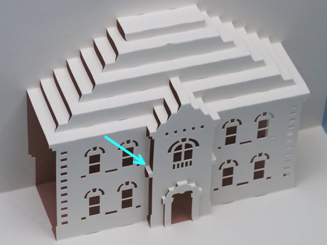
So, in addition to the new works, I also posted improved version of the old works on the main site, so this time I will release two patterns, as the new work “Old Sapporo City Public Hall" and as the improved version “Old Kyosei company".
Please have a look if you like.
[postscript]
Looking at the photo, the notch on the roof that I made to make it easier to fold is quite noticeable, so I don’t really like how it looks. I wonder if it should be reduced.



Recent Comments