Improved church cards
Christmas is coming soon, so I thought I would make a pop-up card of churches from modern Japanese architecture.
Since many of the cards I had made in the past were of churches in Nagasaki Prefecture, I was looking back at those cards.
As I was looking at those cards, I felt like revising the ones I was interested in rather than making new ones, so that’s what I’m going to talk about.
There are no new cards.
Note that since this time I’m not introducing each church, but talking about how I changed them. So I put it in the category “How to make pop-up cards".
Then, I haven’t updated the main website yet. I will update it after I make new cards in the near future.
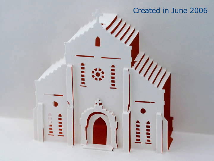
The first photo is of Aosagaura Catholic Church, which I created in 2006.
I must have liked it a lot myself back then.
The wall around the entrance door is slightly retracted. Since only the lower part of the wall is connected to the door, it does not move properly when the door is opened or closed. I left it as it was at the time. But I want to remake this part.
…Then I took another look at the photos of the actual church, and other areas of concern came up. If I’m going to do this, I have to improve everything at once.
I will write down what I’m worried about ..
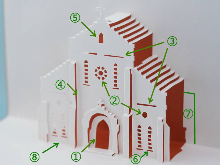
(1) The wall around the door. Connect it with other parts even at the top.
(2) The round window here has a prominent white border, which I think gives a different impression from the card.
(3) The belt shaped decoration was cut out with lines in the previous version, but this method of cutting makes the non-folded parts bend easily, so change the method of cutting.
(4) The center wall and the left and right walls are only connected at the top and bottom, so I would like to create a connection in the middle section as well.
(5) Since this is not a window but a plate with “Tenshudo (meaning church)" written on it, I should not make a hole here.
(6) Compared to the actual building, the window is too low. I would like to raise it a little.
(7) I gave priority only to the shape of the front facade and did not make the Transept. I want to make this part.
(8) Ventilation openings under the floor. If there is a hole here, it will be easier to fold.
I improved these parts and the card became as below.
I like it better than the previous card.
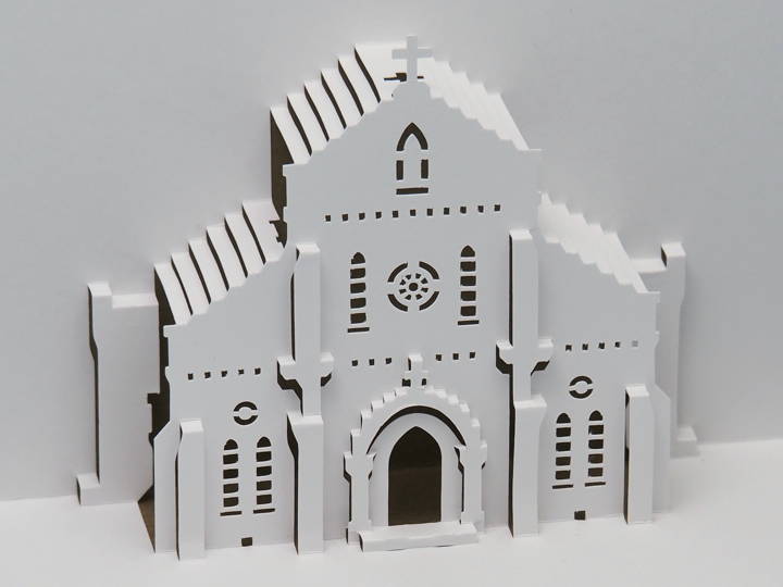
This card is the first improvement in 17 years. I was moved by the fact that I have continued to maintain the website for so long… (The site was opened 22 years ago.)
Next is Hiyamizu Catholic Church I created 10 years ago.
I want to be mad at myself, “You thought this was good enough?"
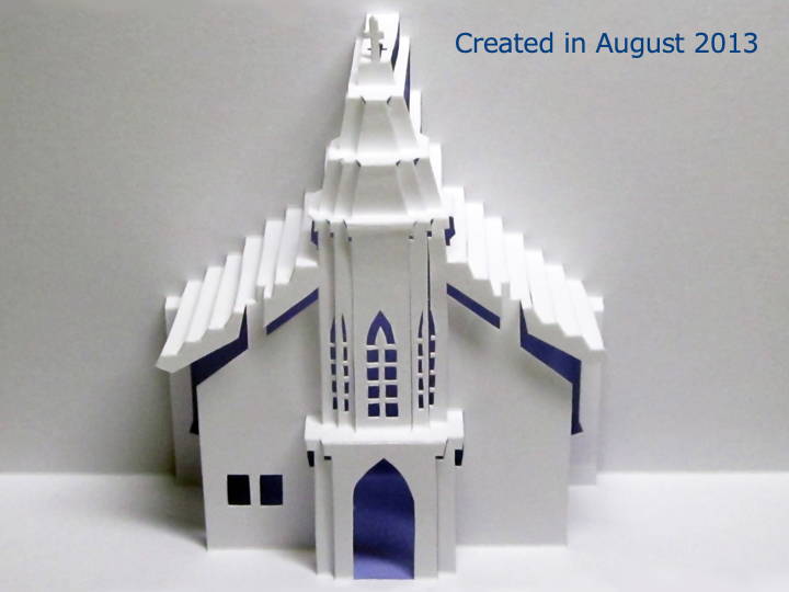
I designed it this way to show the roof sticking out more than the walls, but the left and right sides of the roof have gone up, and it’s not a good shape. It should to be changed the connecting position.
I also made step around the entrance to make it look more like a building.
The Transept was also widened to the left and right.
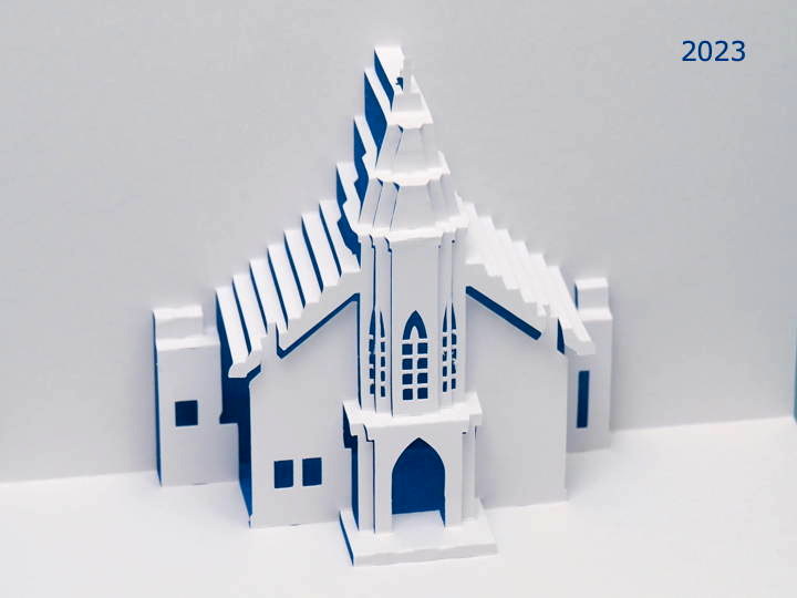
It is easy to see at the line bordering the ground. The long fold line has a cutout to make it easier to fold and bend.
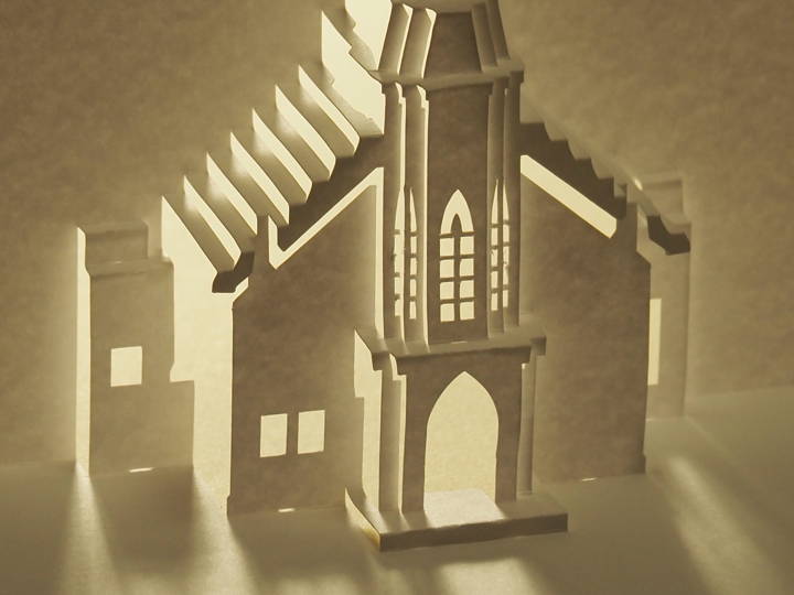
I would like to boast that it is much better than the previous one.
In the margin, I pasted the name of the building, the year of construction, and the designer.
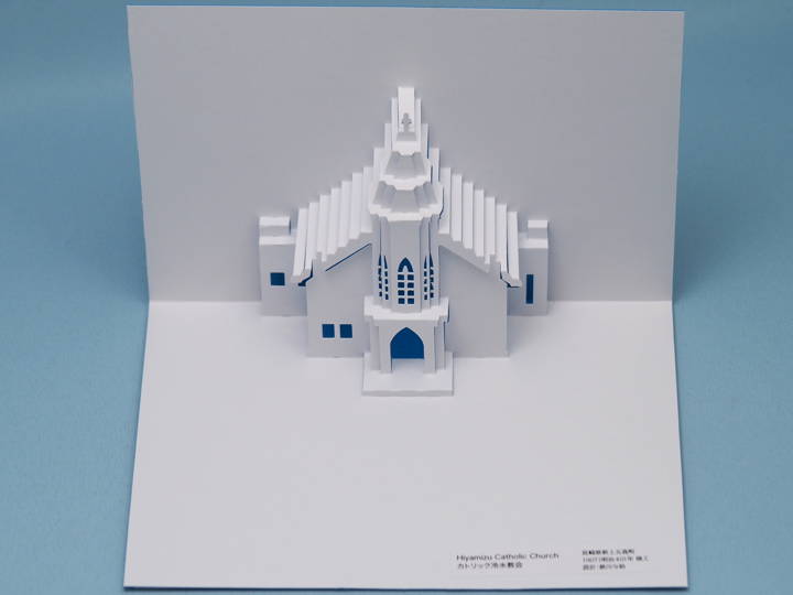
The title of the pattern was too large size, so I made smaller letters separately and printed the pattern. I cut them out and pasted them on.
It was a little tilted, so I was not thorough enough.