Trial and error, making pop-up
Around the 12th and 14th centuries, towers and forts were built as defense facilities on the Absheron Peninsula around Baku in Azerbaijan.
The Mardacan Tower is one of them. It looks as this drawing.
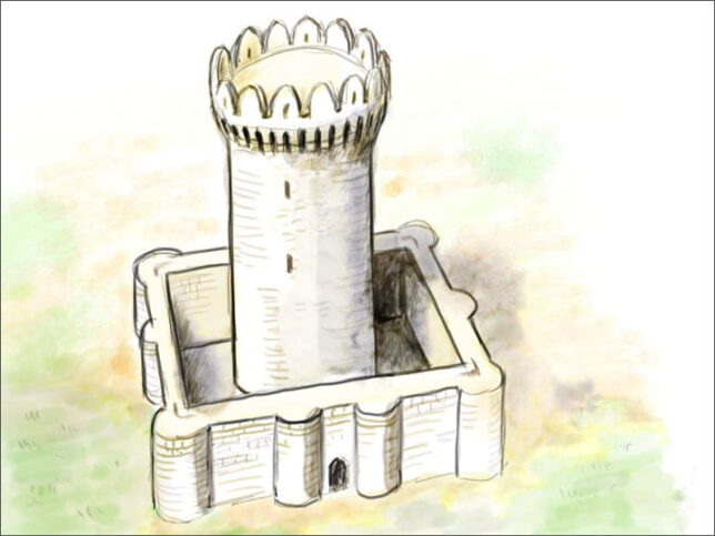
By the way, there are two towers in Mardakan. One is circular and the other is square, so this is called the Mardakan circular tower (Dairəvi Mərdəkan qalası) to distinguish them.
It is a 16m high tower built in the 13th century. A wall surrounds the tower, and the space between them seems unexpectedly small.
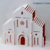
I decided to make a pop-up card modeled after this tower.
It had two problems in making the paper pattern. (1) how to relate the front wall to the cylinder behind it, and (2) how to make the top of the tower wider.
I thought it would be impossible to make it on a single sheet of paper, so I decided to use separate parts from the beginning.
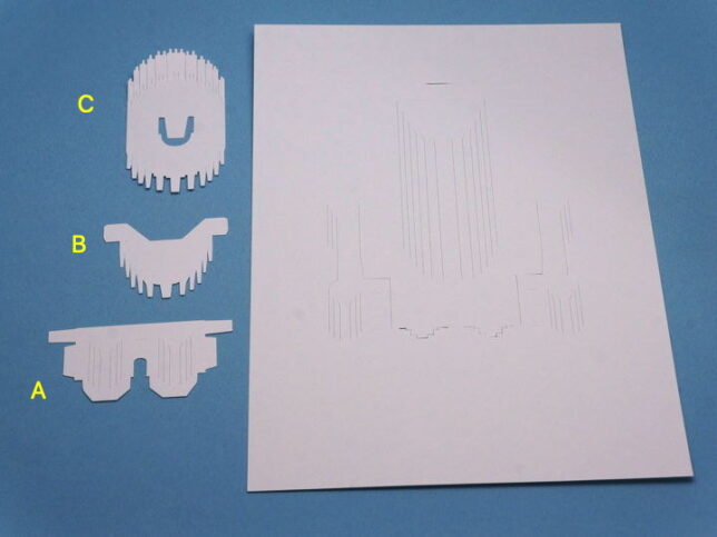
At first, I thought it would only need two parts, but as I made it, it seems need for another piece. So the parts was increased to three piece.
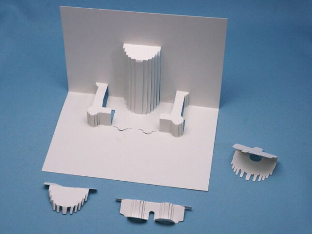
Folding the parts. The cylindrical part of the tower and the left and right parts of the castle wall are made on the base paper.
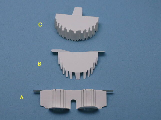
Fold the part C and glue the top and bottom to make it as the photo. Part C is the top of the tower.
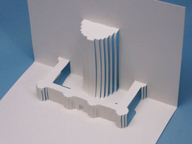
Glue part A to the base paper. Part A was inserted into the slit and glued on the back side, the left and right sides were glued to the wall to fix it.
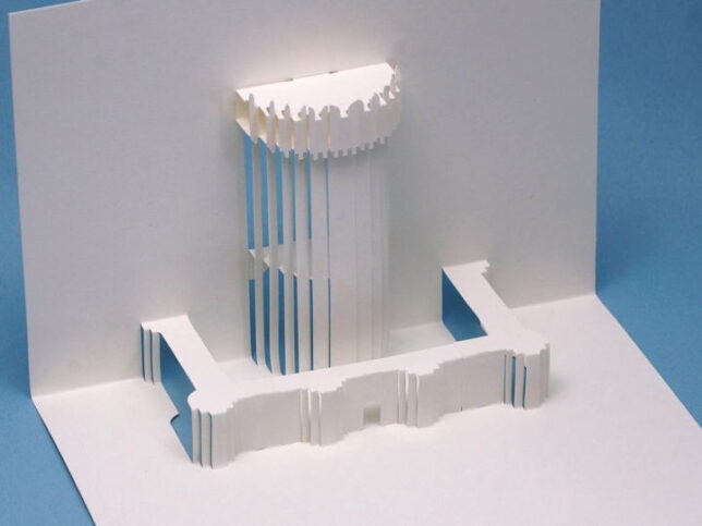
Part C was attached to the top of the cylindrical tower part B was placed at half the height of the cylinder.
At first, I didn’t think that part B was necessary.
But, it was found that when the card was opened with only part C attached, the force applied to the cylinder part increased, and the cylinder was distorted. Therefore, part B was added to reinforce the cylindrical part.
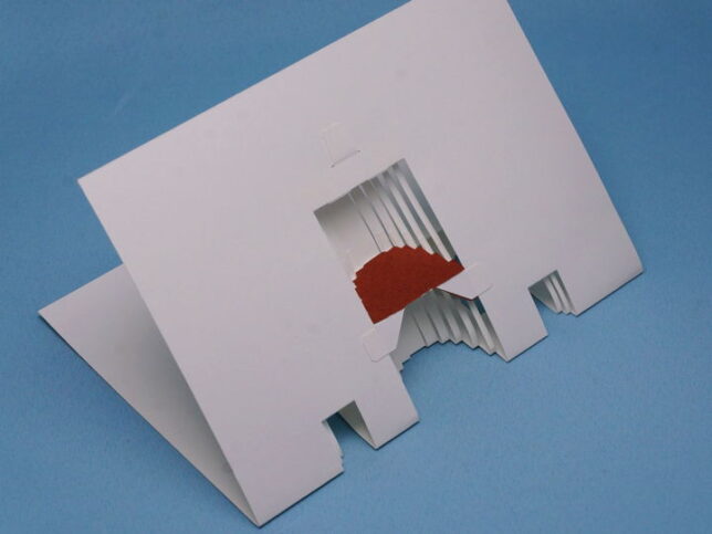
The shape is completed with this, but if the part B remains white, it will stand out when the color drawing paper of the cover is pasted. It’s a support part, I don’t want it to stand out. So I glued a piece of paper of the same color as the cover.
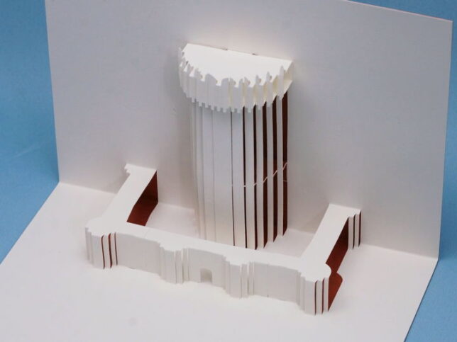
I thought this is completed.
But the the tower looks nothing like the actual tower. It is terrible.
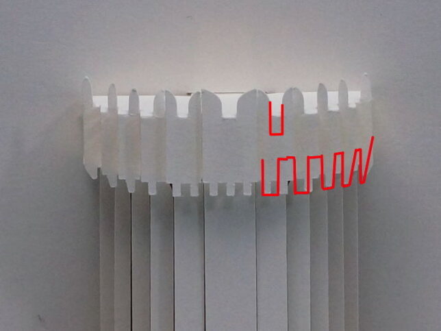
Thinking about what’s wrong, I realize that the cause is the shape of the top of the tower. The convex at the underpart is small, and there are too many. If the convex enlarge as the red lines, it will become better.
And the protruding wall on the top was also small.
I will improve it and make it again.
I thought that if I blog after correcting it, it will be a long time later, so I published the blog though it was in the halfway.
[Postscript]
(2021.01.20) I modified it and published it on the main site.
(Translated : 2021.02.21)

Recent Comments