Pop-up card of Hyokeikan (another trial product)
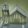
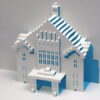
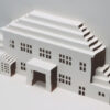
I tried to see how it would look like if the dome was redesigned for the Hyokeikan pop-up card that I posted yesterday.
It turned out like this.
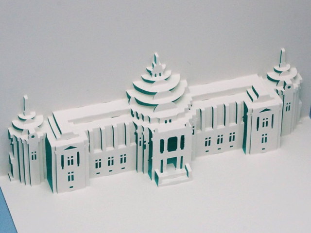
When viewed from the top, the roundness of the dome is felt, and this feels like being good…
But this figure from the front is a bit pathetic… I felt like I could have improved it well, but when I saw this, I was a little disappointed.
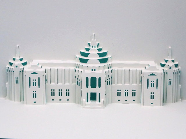
When I put the two side by side, I wonder if the left one is better because it is cleaner and more dome-like.
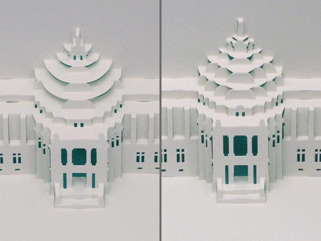
But when I look at them from different angles, the right one seems to have a more solid dome.
I don’t like the fact that there seems to be a big hole on the surface of the dome.
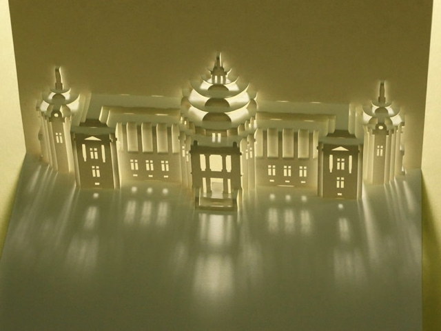
If I publish the pattern, I’ve already decided on the left one. This is easier to fold.
But I will probably release another building’s pattern not this one, so I will post the version I made yesterday on the main site. (I didn’t update the main site once in June, did I?)
***
The rest are actual photos of Hyokeikan.
I searched the data in my hard disk and found photos from 2012, so I’m posting them here.
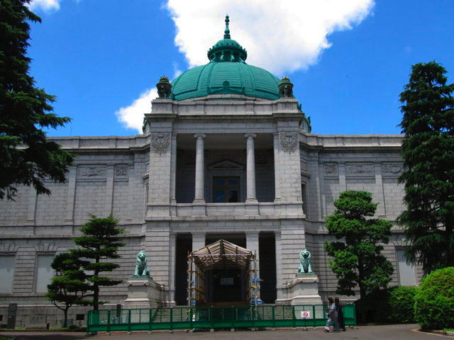
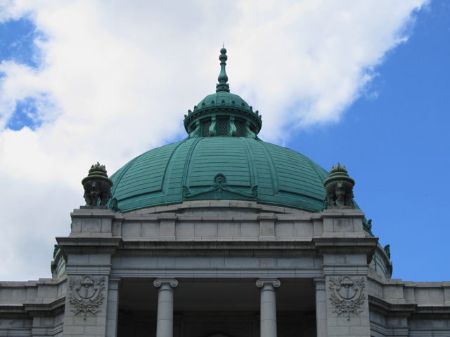
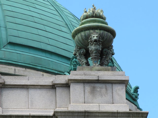
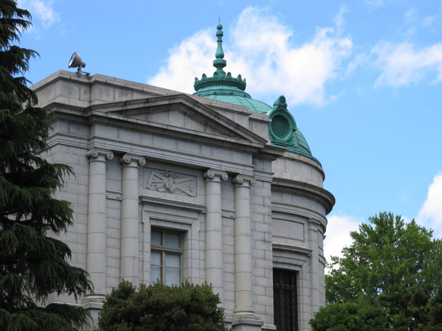
Only the last photo was taken at a different time; I had taken a photo of the lights up in 2010.
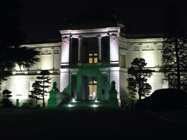
I think the entrance seems to be open at that time, so I should have been able to go inside, but I don’t have a single photo of the inside. Maybe it was almost closing time.
[Postscript] (2020.07.06)
The main site now has photos of the previous day’s version of the blog. The pattern is not available for download.

Recent Comments