Small notch in the fold line
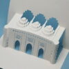
The pop-up card of the former Kyosei Company that I made last time, but when I look at the completed photo, I am worried about the notches in the fold lines.
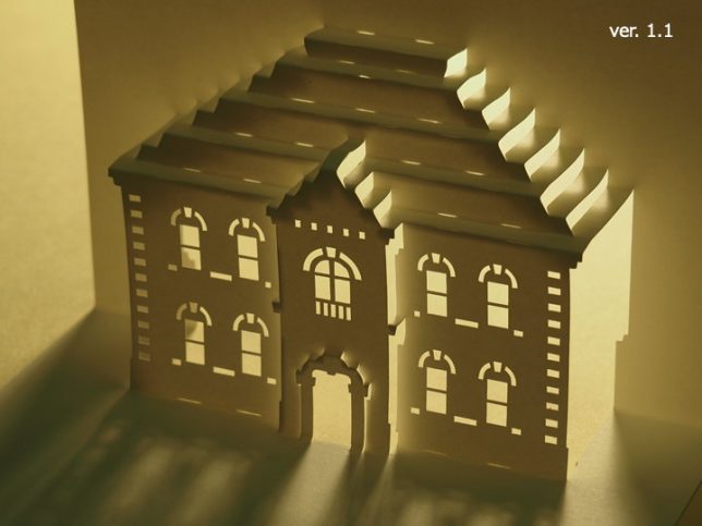
How long is the appropriate notch? I thought it was best to try it, so I remade it.
The length of the previous notch was slightly different depending on the location, but it was about 4.5 to 5 mm, so I tried to reduce it to about half, about 2 to 2.5 mm. How will it look different?
I finished folding.
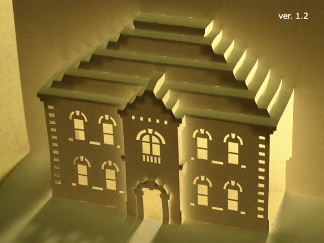
I think the modified card is obviously better.
It’s something to try.
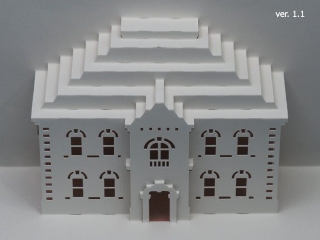
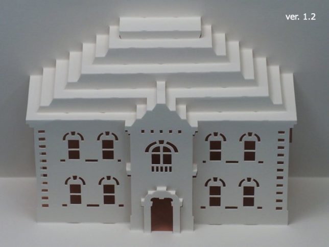
I was worried about the notches in the roof part, so I shorten the notches. But the length of the notches at the boundary with the ground is left as it is. Since the shape of the building is clear here, I thought it would be better to leave it as it is.
[Notice]
Since I fixed the pattern, I replaced the file on the main site. I haven’t changed my password, so you can use the password I started sending a few days ago.
The file name has been changed to avoid confusion when downloading. Since the paper pattern version this time is 1.2, the number “12" is added to the file name.
If you really don’t like the notches in the fold line, you can fold it without notches, so you don’t have to cut it.




Recent Comments